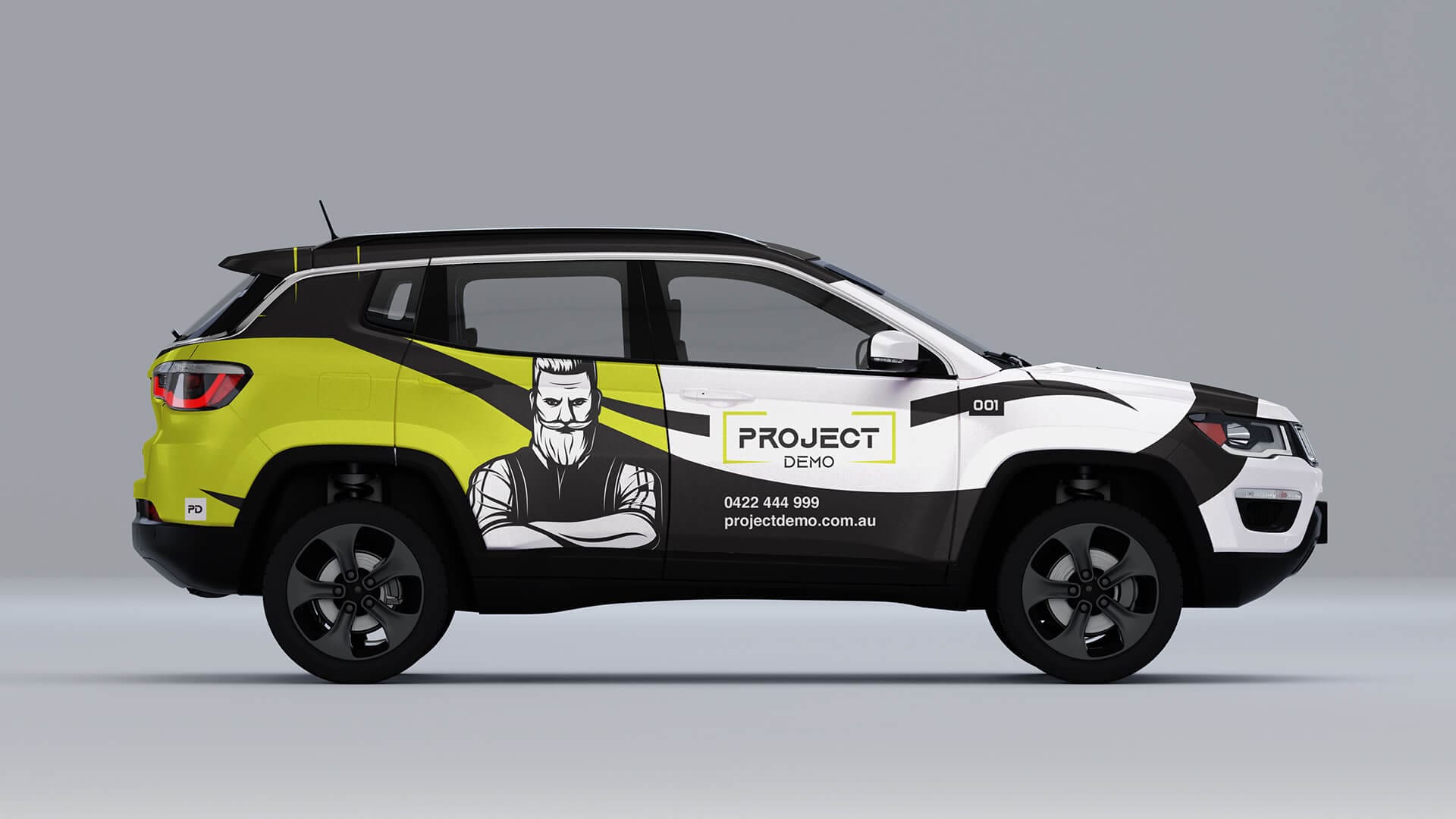

Project Demo: Brand Identity
Project Demo is a distinguished demolition service provider specialising in residential and commercial sectors. With an extensive network of skilled tradesmen and a wealth of experience, they excel in delivering high-quality demolition and strip-out services, tight access projects, rubbish removal, labour hire, asbestos removal, and remedial work.
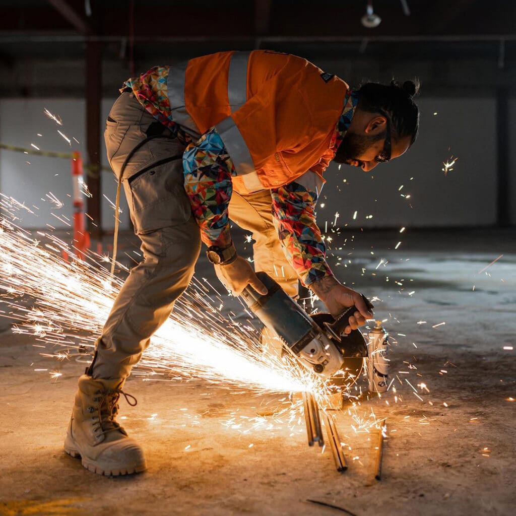
Precision in Every Demolition
Project Demo excels in delivering top-quality demolition services, on schedule and within budget.
"Our dedication to safety, sustainability, and precision sets us apart, making every project a benchmark for excellence."
Anthony Theodosio
Project Demo Scope
When Anthony Theodosiou of Project Demo, an innovative startup, chose BrandUnity as their collaborator, they were seeking a unique logo and brand identity to mark their entrance into the demolition industry. Our partnership blossomed into the creation of a brand identity that stands as a testament to Project Demo’s expertise and commitment.
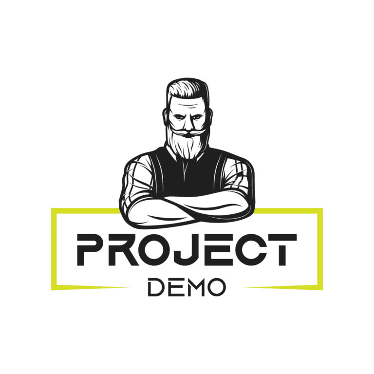
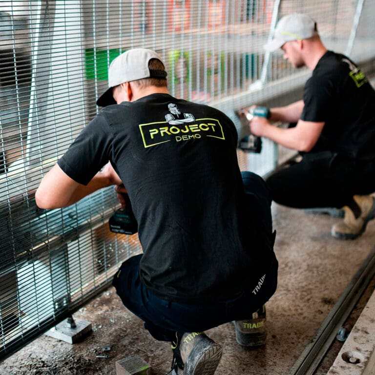
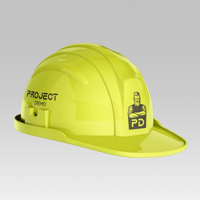
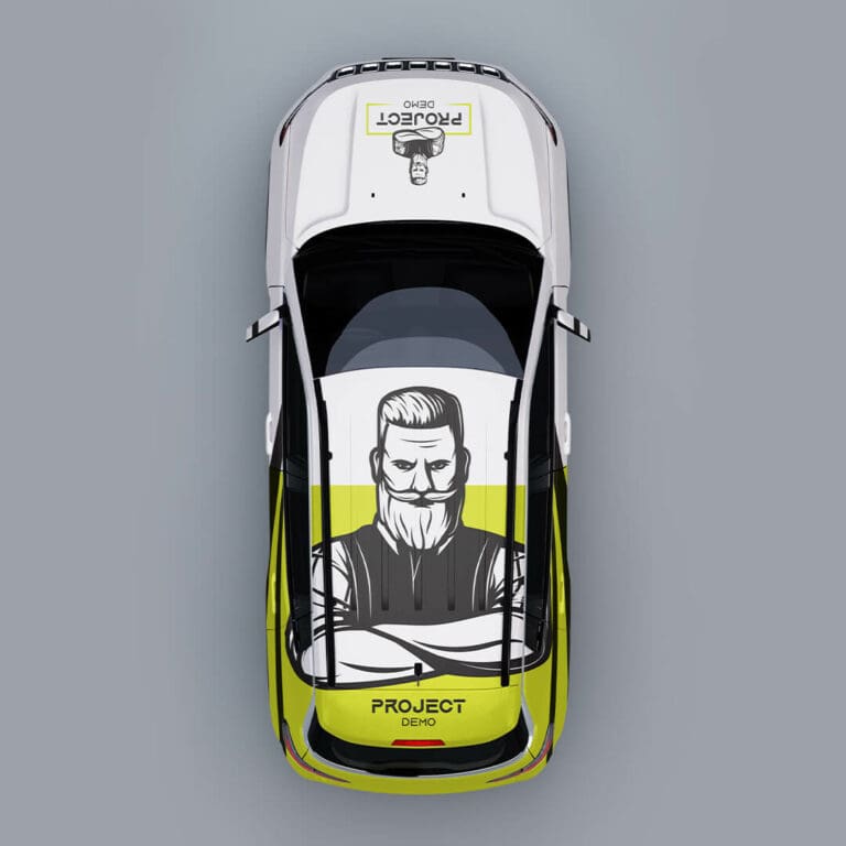
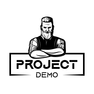
At the heart of Project Demo’s brand identity lies a distinctive logo: a bold figure adorned with a striking beard, symbolising the strength and mastery that are the hallmarks of their trade. The choice of a monochrome palette, highlighted with a vibrant shade of yellow, positions Project Demo as a beacon of excellence, radiating confidence and professionalism in the demolition sector.
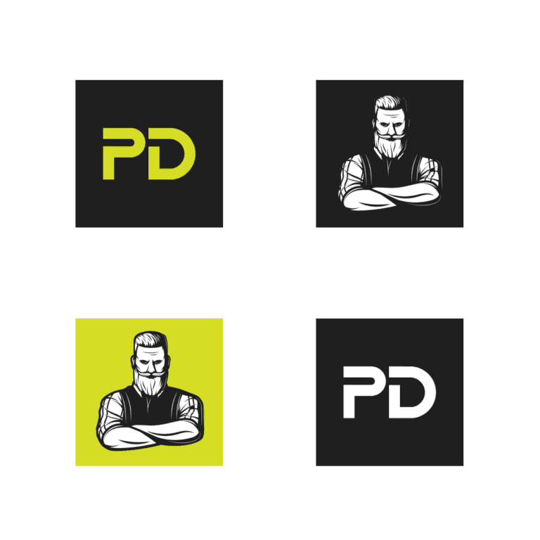
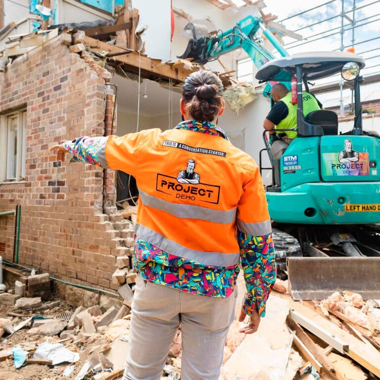
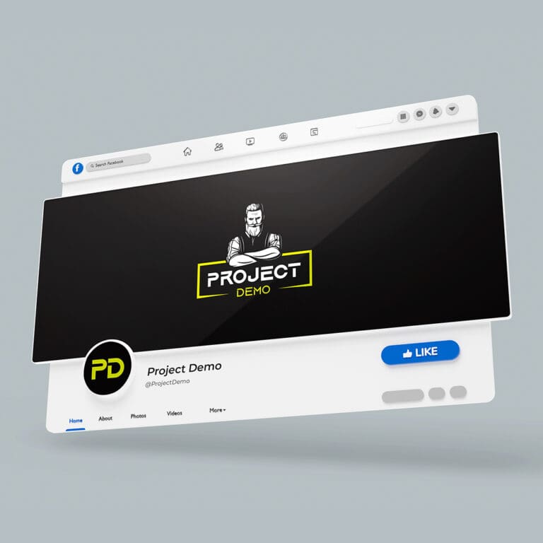
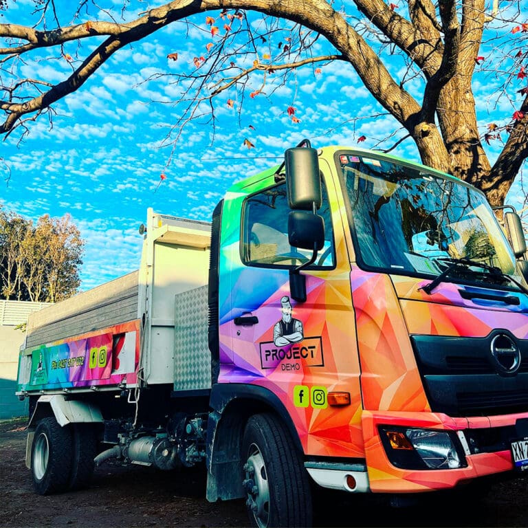
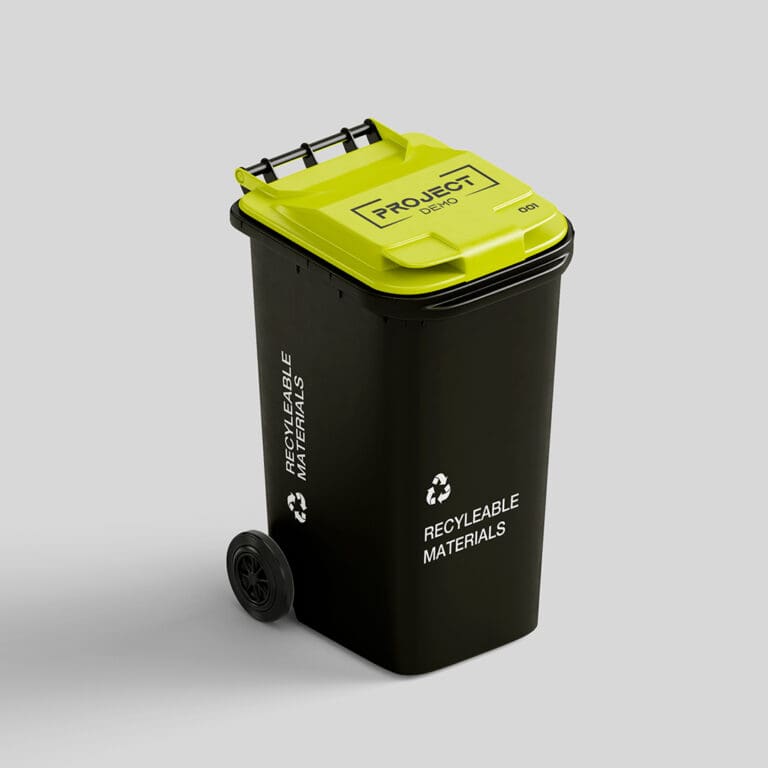
Understanding the dynamic nature of brand representation, BrandUnity crafted a suite of logo variations for Project Demo, each tailored for specific contexts and applications. This range of logos ensures that Project Demo’s brand identity remains flexible and versatile, ready to make a powerful impact whether on digital platforms, in print, or in the physical workspace. The monochrome versions offer a classic, understated elegance, while the bold yellow variant commands attention, exemplifying the brand’s energy and innovation. Each variation is a strategic piece of a larger brand puzzle, fitting seamlessly across various mediums to maintain brand consistency and recognition in every public interaction.
Our visual strategy reflects their unwavering dedication to precision, safety, and environmental stewardship. The logo’s straightforward, impactful typography mirrors the clarity and dependability Project Demo offers, assuring clients of their comprehensive approach to every challenge, from demolition to strip-outs.
But this brand identity transcends mere aesthetics. It’s a pledge of trust and a beacon of top-tier quality that Project Demo commits to in every venture. This collaborative effort showcases our dedication to crafting bespoke solutions that not only elevate businesses but also resonate deeply within their communities.
- Logo & Brand Identity
- Graphic Design
Ben Armstrong
CEO & Founder
